

SugarCult Brand Storytelling
SugarCult was developed from the ground up, employing powerful brand storytelling techniques. The company is dedicated to reshaping perspectives on candy, offering customers an immersive experience upon entering their stores. The name "SugarCult" encapsulates the brand essence: a blend of sweetness with an edgy twist. This theme is reflected in the design, which merges a cult-like aesthetic with the allure of sugary delights.
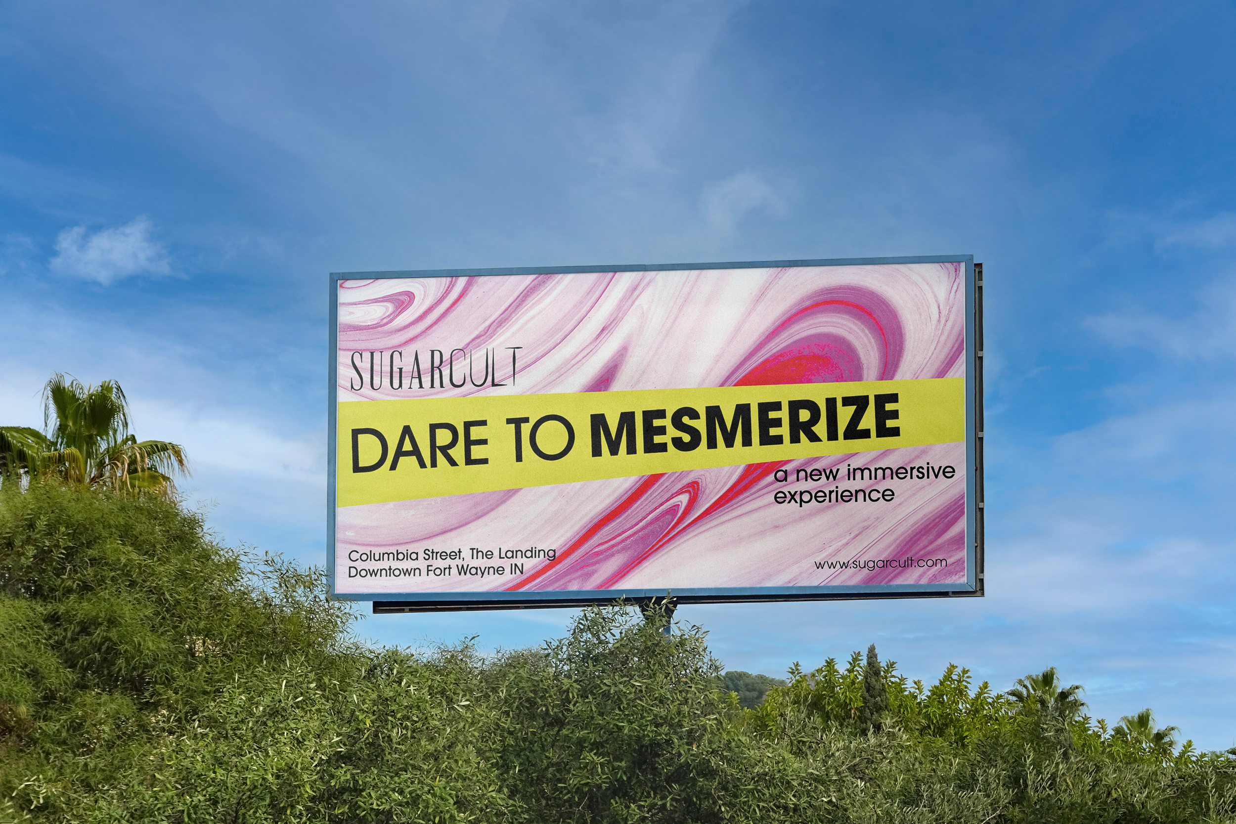
Deliverables for this project encompassed crafting a comprehensive brand identity complete with a detailed style guide, producing a commercial, and designing advertisements for placement in magazines, online platforms, and on billboards.
The logo creatively embodies its name through the juxtaposition of contrasting typefaces and colors. "Sugar" is presented in a straightforward serif typeface, adorned in light pink, while "Cult" is depicted in a bold, sharp typeface in vibrant yellow.
This sharp contrast became a central visual motif across all deliverables, whether through impactful headlines juxtaposed against the design, or vibrant colors set against photographs and textures.


This logo was designed for a fictional company created by myself. Please refrain from distributing or using it for personal purposes.